
I remember seeing that embossed finger icon on the push pad of the drinking fountain at Narita airport. I was so fascinated by it – adding that finger icon shows the user where to push and which part of the body to use. Some may think that the finger icon may be unnecessary considering how ubiquitous and perhaps straightforward drinking fountains are. But I personally find it necessary thinking of the millions of travelers from different parts of the world who travel or transit to Japan every year. I know it is really helpful for kids!
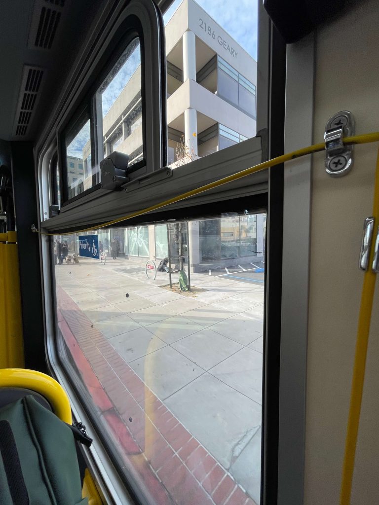
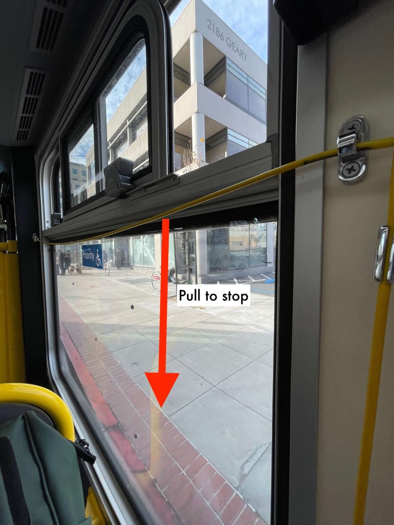
48 hours later, I was in a public bus in San Francisco headed to the Golden Gate bridge viewing deck and saw people pulling the yellow cable cord along the windows to request a stop (image above). I am used to seeing those red buttons with the word “STOP” in buses that this yellow cord was quite unusual. Now, the question is, what if I was alone in the bus, would I have known that this is the “stop” mechanism? No! There were no signs telling me how to do it. Something like below would have been helpful.
So I asked ChatGPT to tell me what’s the rationale behind the yellow cords. This is what AI told me.
The yellow cord is actually designed for a different kind of usability:
- It runs along the entire length of the bus.
- Passengers don’t need to reach a specific button.
- It works from any seat position.
- It’s easy to grab quickly while seated.
I haven’t spent much time on a San Francisco bus to say if the yellow cord is actually more convenient for the passengers. But one thing I could say is that the yellow cord is less intuitive. It is not user-friendly in a sense that the user needs to see other passengers first to act on it. Maybe adding a finger icon and a down arrow might help?
I am a fan of making it easy and intuitive for people to understand how a thing works. This is why I loved that embossed finger icon at Narita airport! We are all so busy and caught up with so many thoughts already. The last thing we need is to spend so much time figuring out how a thing works. The user experience should be intuitive.